What if we regulated Facebook like we regulate cigarettes and pharmaceuticals?

A new class of addictive products with destructive implications
Almost a decade after Nir Eyal’s Hooked outlined the way social media’s addictive algorithms are designed to dominate our attention, the effects have burst from the digital world to the streets of the nation and halls of the capital. It wasn’t a surprise, foreseen by many a think-piece writer and well documented in the fantastic HBO series Q:Into The Storm.
What’s the obvious parallel to these addictive, potentially destructive products? That’s right, drugs. I have nothing against drugs or social media in the right context — I got my design career off the ground helping create social media campaigns for pharma companies. It was an experience that taught me all too well that navigating the regulations in the space was a fulltime job in and of itself.
So why should we allow these multi-billion dollar companies off the hook?
A brief intro to tobacco and pharmaceutical advertisng regulation
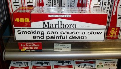
Nicotine advertising regulation is justifiably severe. We’re all familiar with the surgeon’s general warning, but the FDA goes further with regulations ranging from the flavors that can be sold to the descriptors on the packages (the words “light” and “mild” were eliminated from packaging in 2017. A few examples:


You’re probably not surprised to learn regulations also extend to the web. A quick browse of a few popular brands shows similar surgeon’s general warnings glued to the corners of the screen.


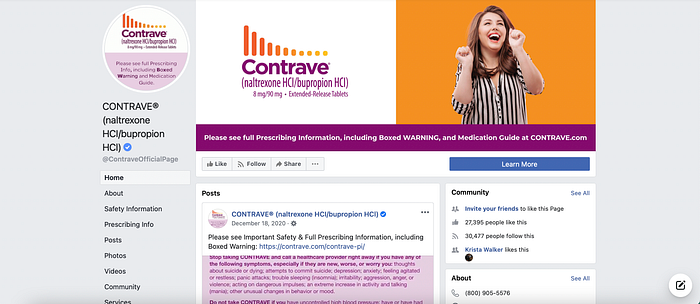
Similarly, pharma ads in print or on the web are chiefly governed by the principle of fair balance. Fair balance essentially states that for every claim of drug benefit the risks must be stated in equal measure. Usually, in practice, this means that pharma sites, emails, or social media pages are 50% benefit information and 50% “Important Safety Information”(ISI) which you might know better as all the speed reading you hear at the end of any pharma radio or TV ad. This is mandatory even though pharmaceuticals are rarely actually physically addictive.
This reguation was taken so seriously where I worked it could sometimes threaten to destroy any semblance of a user experience. Many of my days were spent exploring ways to keep the ISI up to regulatory standards while managing to present the actual benefits of the drug.


Applying the same standards to social media
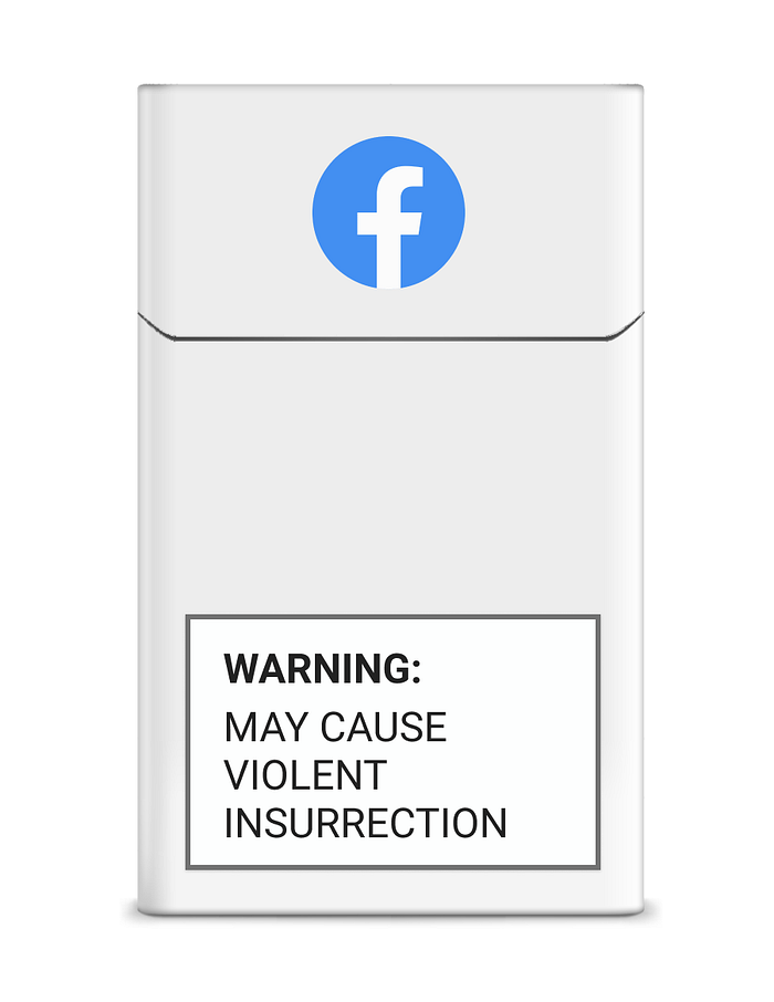
In practice these standards could threaten to destroy the experience on some of our most loved (and most dangerous?) social media platforms. There might not be any real world images quite like the box at the top of this article, but perhaps the potentially deleterious effects on each user’s perception would be more obvious with a message attached to any given feed or notification. Here are some quick, dirty mockups applied to a few of my most used platforms.
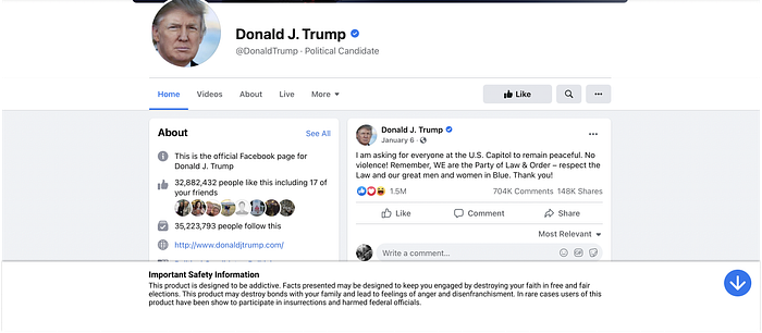
Facebook Home
For this exploration I gave Facebook the standard pharma sticky footer treatment. When I was doing pharma sites we were typically required to three lines of ISI, so I used a similar treatment here.

Instagram Explore
Pharmaceutical web ads are typically required to have ISI take up about a third of the ad space, even when presented in a small banner somewhere on the web. In practice the Instagram explore page serves a very similar function — and is completely unusable with addiction and adverse effects listed.

Notifications
Even notifications take on a very different feel when held to strict standard. The image here illustrates the degree to which the algorithms may not even know what sort of content you’re looking at. No offense to the Reddit user blowing me up at the time of this writing!

The path forward
Now in practice I think this approach could be overly severe. Under the right circumstances social media is a wonderful tool that helps us discover new interests, and engage with new communities. However, it shows there are avenues to regulation already applied in other powerful industries, and that we have the means to change the way we deal with information in digital spaces. Faced with the sometimes unfathomable reach of social media giants it can feel like we’re powerless, but even small steps will lead to huge ripples in the real world.

